Monochromatic is in! As a result, we’ve designed our collections in the same colors across different product categories, ensuring continuity in your outdoor space. Monochromatic doesn’t have to be boring. If done right, it can create more visual appeal than a space full of colors and textures! Keep reading to learn how to master the art of monochromatic design!
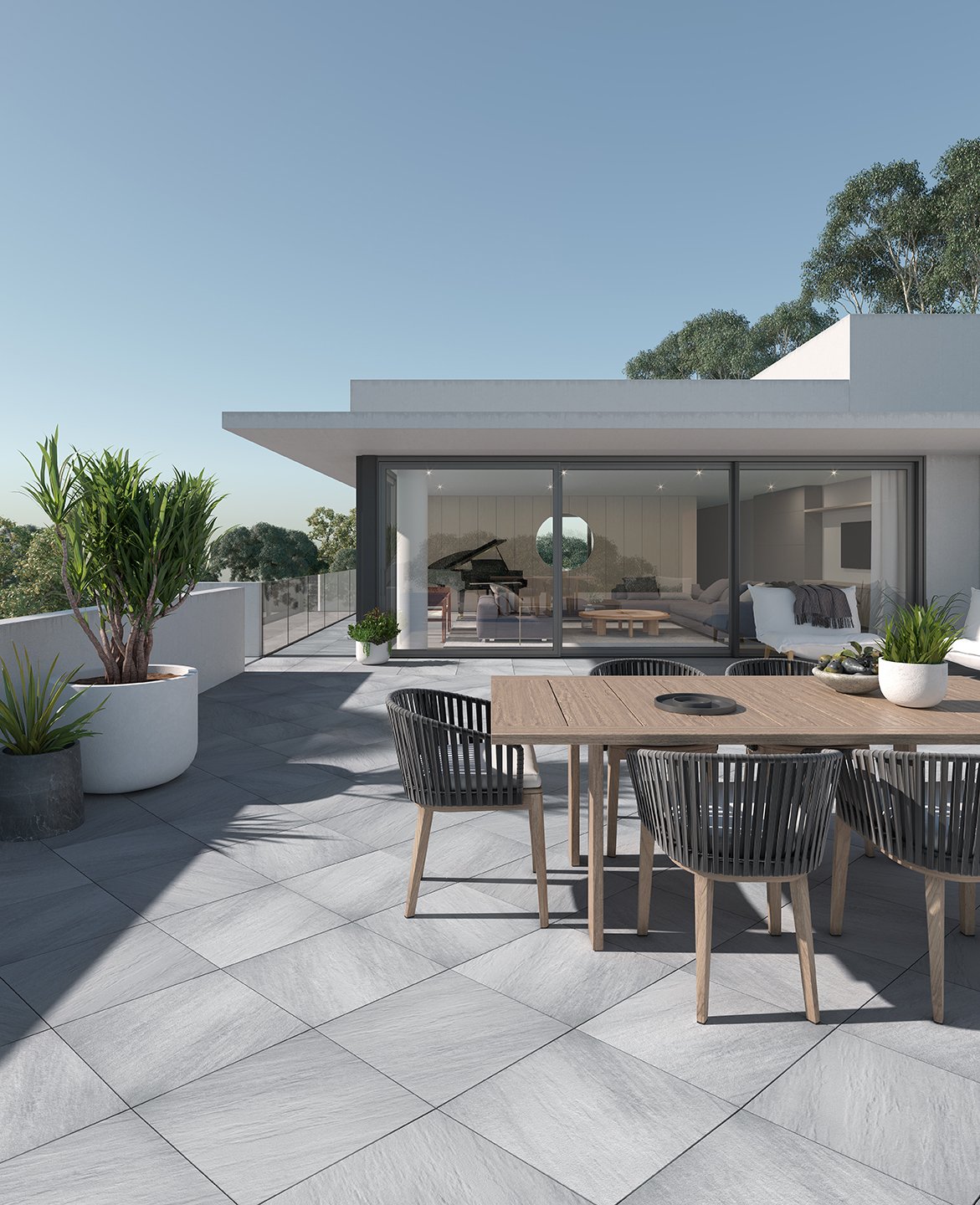 Featured product: Everest patio slab
Color
Grey and beige tones are very popular at the moment. These color options are easy to pair and blend seamlessly into any exterior. They also allow homeowners to create strategic pops of color with outdoor accessories and flowers.
When choosing your colors, we suggest selecting one base color that will define your outdoor space. The other colors you decide to select should be in the same family in order to create a cohesive look. We recommend choosing both a lighter and darker shade of your base color.
Unity is the main objective of monochromatic design, however too much unity can be bad. If every element of your space is of the exact same color, you run the risk of making your exterior boring. Pops of color in accessories, such as outdoor cushions or flowers, can really break up the monotony of your space. Monochromatic doesn’t mean that everything has to match. Vibrant hues in surrounding elements allow you to color outside the lines a little bit.
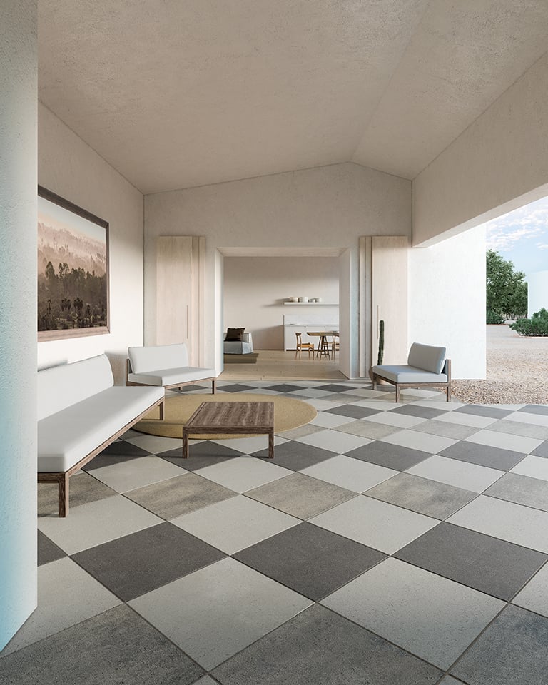 Featured product: Industria patio slab
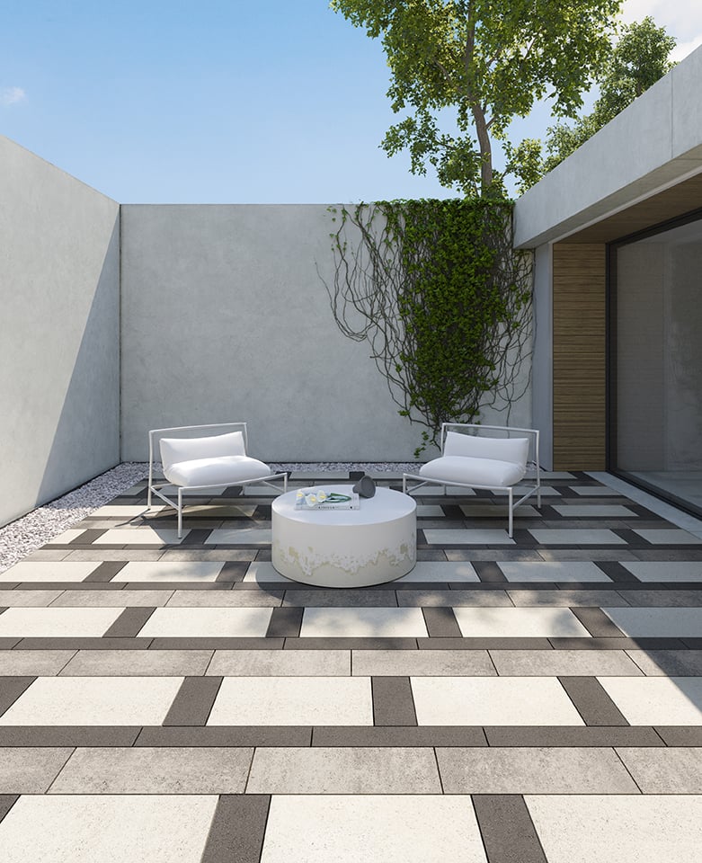
As seen in the project pictured above, we used three different shades of grey to create an eye-catching, yet subdued look. Notice how every other element in the space is minimal? No cushions, no flowers, no patterns, nothing. That's because when trying to create a monochromatic design, you need to pick one element of your space that will stand out. You know when they say a women can either wear a bold lipstick or a bold eye but not both at the same time? That rule applies to monochromatic designs. Pick your element and run with it. Keep everything else simple and classic. This design is a perfect example of how original and unique elements can be added to a space without being flashy.
That being said, the elements you chose should include your base color in some way. This ensures cohesiveness in your design.
Don't be afraid to play with our palette of coordinating and contrasting hues to inject visual interest and create a customized look that’s right on tone.
Textures and patterns
Let textures and patterns do the talking in your outdoor space! They will no doubt add instant visual appeal to your monochromatic design.
Keep in mind that you should always aim to select textures and patterns that fit with your color scheme. If you’ve selected monochromatic tones that are simple and classic and you choose a texture or a pattern that is loud and over-the-top, your design won’t make sense. Identify the feel of your space and respect it in every design decision you make. Our Aberdeen and Ocean Grande patio slabs are two examples of textures that add just the right amount of visual appeal to match a monochromatic outdoor space.
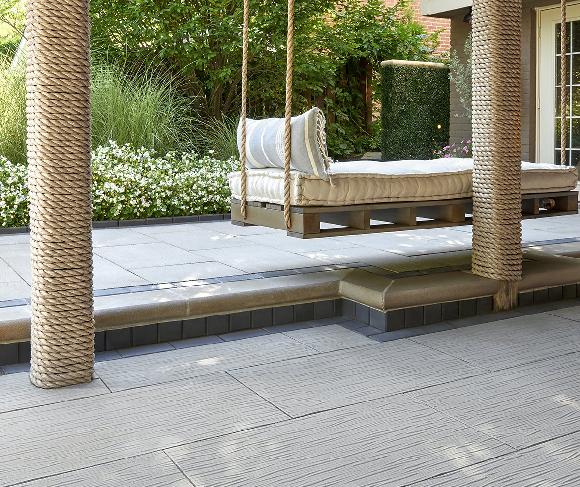 Featured product: Ocean Grande patio slab
The project pictured above is an example of how using the right texture can truly elevate your outdoor space. Notice the subdued colors used throughout this design. The texture, like the light grey color, is as subtle as can be. You almost don't even notice it unless you focus in on it. It just adds that extra touch without being too loud. It's the perfect accent to this already perfect space.
It’s important to keep unity in mind when selecting eye-catching elements for your outdoor space, either in color or in texture. In fact, according to Gestalt Psychology, whenever we enter a new space, our brains rely on pattern recognition to make sense of a room. The more patterns we find – repeated colors or textures – the easier it is for us to process. The quicker we’re able to make sense of a space, the more aesthetically pleasing we’re likely to find it.
Uniformity across categories
Monochromatic design also means pairing products, colors and textures that blend seamlessly together. With that in mind, we've designed a few collections that extend to many different product categories, allowing you to do just that. Take our Travertina Raw stone, for example. Its unique texture extends from pavers and slabs, to retaining walls and wall caps. This extension allows you to create uniformity in color and texture in your backyard!
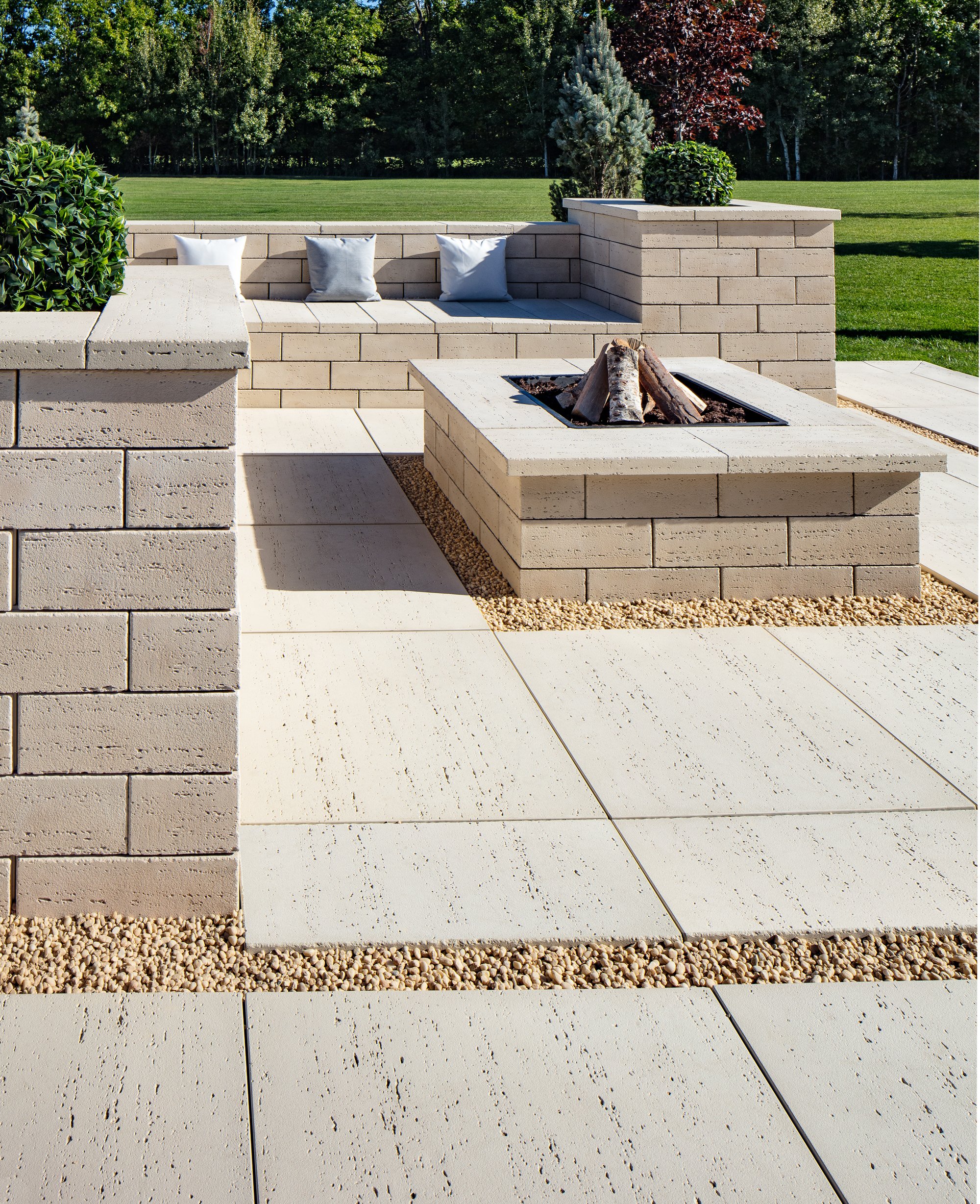 Featured products: Travertina Raw patio slab, retaining wall and wall cap
A monochromatic design makes a space look effortlessly pulled together. Not only that, but they are also classic and timeless which means they won’t ever go out of style! When investing in an outdoor space, you need peace of mind knowing that your investment will stand the test of time, not only in durability but in style! The ideal part of monochromatic designs is that the eye-catching elements are usually the surrounding elements, such as accessories and landscape. Your pavers and more permanent elements will remain relevant for years to come!
To learn more about how to mix and match paving stones to create unique monochromatic designs, visit our design playground page!
.jpg)
